
Are your students getting distracted easily? Do your kindergarten classrooms feel chaotic instead of calming? Have you ever wondered if the colors on your classroom walls could be quietly influencing how your children learn, behave, and focus? In the rush to buy desks, toys, or teaching materials, classroom colors often get overlooked—but they play a surprisingly powerful role in early childhood development.
The colors you choose for your classroom aren’t just about looks—they directly impact how young children focus, feel, and absorb information. Choosing the right classroom colors can enhance learning outcomes, reduce anxiety, improve classroom behavior, and even promote creativity. From calming blues that help with concentration to vibrant yellows that inspire joy, every shade you paint on the wall (or place on a rug, shelf, or bin) sends a signal to your students’ brains.
In this guide, I’ll show you how to create the perfect colorful classroom environment. Whether you’re redesigning a preschool space, planning your kindergarten classroom theme, or just looking to pick the best classroom paint colors, this article will walk you through all the essentials backed by educational psychology and real classroom experience.

The Psychology of Classroom Colors in Early Childhood Education
How Colors Shape Emotions and Behavior
Understanding the psychology behind classroom colors is essential when designing environments for early learners. Colors aren’t just a matter of decoration—they’re tools that subtly influence children’s psychological and emotional states. For young minds, especially in preschool and kindergarten, visual cues like color have a significant impact on how safe, stimulated, or calm they feel in a given space.
Stimulating vs. Calming Colors
Bright colors such as red, orange, and yellow tend to stimulate brain activity and are great for creativity zones or play areas. These hues energize children, encouraging action and imagination. However, too much stimulation can lead to distractions or restlessness, so it’s important to balance these vibrant colors with calming shades.
On the other hand, calming colors for classroom settings—like soft blues, greens, and lavender—help soothe young children. These colors support focus, reduce stress, and create a tranquil environment that promotes better behavior and learning. Research has shown that classrooms painted in soft, cool tones experience fewer behavioral disruptions and greater task completion rates.
Cultural and Individual Color Perception
It’s also important to remember that color associations can vary culturally and individually. For instance, while blue is often viewed as calming in Western cultures, other communities may assign it different meanings. When selecting a classroom color scheme, consider the background and emotional associations of the children you serve.
Strategic Use of Color Themes
Incorporating a variety of classroom color themes strategically—rather than relying on a single dominant hue—can help support a broader range of learning activities and emotional needs. For example, using soothing classroom colors in reading corners while reserving brighter tones for activity tables creates a natural flow in the room that supports both calm focus and energetic engagement.
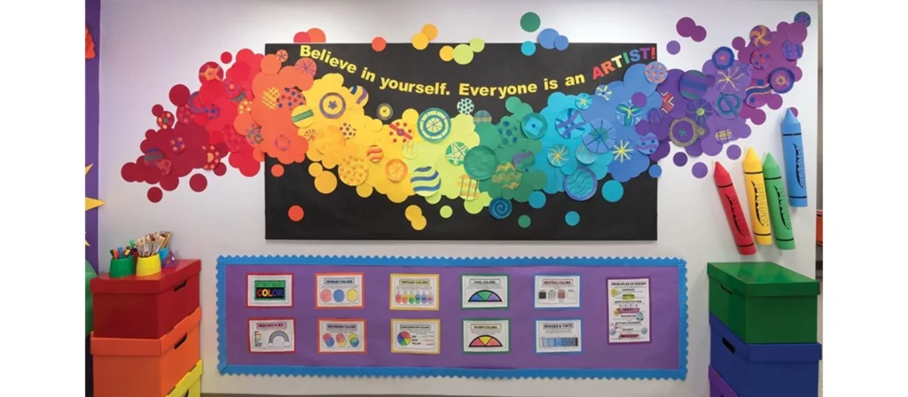
Visual Reinforcement Through Color Posters
To reinforce the learning process visually, many educators also use color posters for classroom use, tying color schemes to classroom rules, behavior charts, or seasonal themes. These classroom color visuals aren’t just decorative—they provide consistent, comforting structure to the learning environment.
Purposeful Color Integration
Finally, when integrating color psychology, it’s important to remember that the best classroom color schemes are purposeful. Whether you use classroom coloring pages for thematic learning or apply best colors for classroom walls during renovation, your decisions should always reflect a clear understanding of your students’ developmental needs.

Why Color Matters in the Classroom Environment
First Impressions and Daily Impact
Color has a far more powerful impact on the learning environment than most educators realize. While it’s easy to think of classroom colors as merely decorative, research shows that the visual tone of a space—particularly in early education—can influence everything from classroom behavior to cognitive development.
When children walk into a colorful classroom, their brains begin processing visual information immediately. That first impression can either stimulate or overwhelm, depending on the classroom color scheme. Colorful classroom designs that are well balanced create a sense of excitement and order. Conversely, poorly chosen colors or mismatched schemes can cause distractions, stress, or even behavioral issues.
Evidence from Research and Education Experts
Educators and researchers have increasingly studied how classroom color affects mood, behavior, and attention span. A report from Edutopia found that well-designed color schemes help maintain student engagement throughout the school day. Colors like green and blue support sustained concentration and reduce fatigue. Meanwhile, soft yellows and peach tones are linked with optimism and happiness—ideal for encouraging emotional comfort.
Functional Design with Color Tools
Colorful classroom rugs and colored baskets for classroom use are more than cute décor. These visual anchors serve as orientation cues, especially for younger children who are still learning to navigate structured spaces. Teachers often use colorful classroom bins to assign tasks or designate play centers, helping children associate certain colors with specific activities or behaviors.
Setting the Tone for Classroom Culture
In early childhood settings, the color palette sets the tone for the classroom culture. For instance, calming classroom colors help develop an atmosphere of mindfulness, while brighter, energizing shades stimulate verbal participation. By purposefully mixing both calming colors for a classroom and energizing ones in designated zones, teachers can improve classroom flow and reduce behavioral problems.
Enhancing Learning Through Visual Activities
Additionally, the use of classroom coloring pages and coloring posters for classroom walls can make abstract ideas more tangible. Want to teach color names in English or Spanish? Or explain feelings and emotions? Color-based visuals offer an accessible way to bridge developmental gaps.
A Foundational Element in Design
Ultimately, when it comes to creating learning environments that support child development, classroom color is not an afterthought. It’s a foundational layer that impacts how students feel, learn, and behave each day.

Calming Colors for Classroom Focus and Emotional Stability
Why Calm Matters in Early Learning
In the hustle and bustle of a kindergarten or preschool, children are constantly experiencing new sounds, ideas, and emotions. Using calming colors for classroom design is one of the most effective ways to create a sense of psychological safety. Soft tones like pastel blue, light green, taupe, and lavender can help reduce anxiety and overstimulation, both of which are common in young learners.
These calming classroom colors support concentration, especially in quiet zones such as reading nooks or individual workstations. Studies have shown that students working in spaces painted with cool tones are more likely to stay on task, self-regulate their behavior, and remain emotionally balanced throughout the school day. The right classroom colors can support both mental clarity and emotional comfort.
Creating Calm with Balanced Color Choices
It’s important to strike a balance. Too many neutral tones can make a space feel dull or uninspiring, which is why a good classroom color scheme pairs calming base tones with cheerful accent colors. For example, slate blue color combinations with soft yellow bins or green table legs provide calm with subtle stimulation. This is especially helpful for teachers trying to manage sensory-sensitive students.
Calm classroom colors also affect the acoustics and perceived lighting of a space. Lighter tones reflect natural sunlight more evenly, creating an open, airy feeling. On the other hand, rich earth tones like terracotta or muted purples can add warmth and comfort to spaces like nap zones or mindfulness corners.
Practical Tools for a Calm Classroom
Using colored bins for classroom materials not only helps with organization—it also reinforces emotional zones. A soft green bin might hold quiet-time activities, while a calm lavender-colored basket might designate the peace corner. Calm colors classroom decor like curtains, rugs, and bulletin board backgrounds can tie the whole classroom theme together.
Educators also find success in incorporating classroom coloring activities with a focus on calm. For example, classroom coloring pages that feature natural landscapes or coloring posters for classroom meditation moments allow students to express emotion non-verbally and center themselves. These techniques are particularly helpful for preschoolers who are still developing verbal communication.

Stimulating Colors for Creativity and Engagement
Boosting Energy with Bright Classroom Colors
Stimulating colors in classroom environments—such as orange, red, and bright yellow—can increase student engagement and encourage verbal participation. These energetic classroom colors are especially beneficial in active zones like art corners, group tables, and performance areas. When used properly, colorful classroom themes with warm tones evoke excitement and promote creative thinking.
A good strategy is to apply vibrant hues sparingly as accent colors against neutral backgrounds. For example, classroom color schemes that feature bright red bins or orange wall panels near activity stations provide the right amount of stimulation without overwhelming the senses. These colors are especially effective in spaces designated for dynamic tasks like storytelling, group collaboration, or dramatic play.
Classroom Colors That Encourage Expression
When it comes to designing a colorful classroom that fosters creativity, don’t underestimate the psychological power of brightness and saturation. In younger students, warm colors are known to spark imagination and make the classroom environment feel more friendly and inclusive. Many educators use colorful classroom decorations such as handmade banners, student art displays, and interactive bulletin boards in bold shades to foster emotional expression and community participation.
Classroom coloring pages and coloring posters for classroom projects help students develop fine motor skills while exploring color creatively. Allowing students to contribute to a classroom coloring sheet wall or rotate themed coloring pages for classroom collaboration adds student voice into the learning environment while reinforcing classroom color visuals. This not only decorates your space—it gives students ownership and pride.
Finding the Right Balance of Classroom Colors
Even when using vibrant colors, balance is essential. While a completely red or orange room can lead to restlessness, pairing energetic tones with calming classroom colors like sage green or sky blue can create harmony. It’s common to combine active corners in bold tones with quieter reading zones in calm classroom colors.
Additionally, classroom color schemes should consider lighting. Bright colors reflect more light and can make small spaces appear bigger, while deeper tones create coziness. Good classroom color selection should maximize the space’s natural light, reflect the personality of the teacher and students, and align with the school’s mission or curriculum.
To support a creative learning space, educators can also use colored baskets for classroom supplies, classroom pictures to color, and preschool color-themed centers. All of these support multiple intelligences and learning styles in a stimulating, student-friendly way.

Best Classroom Color Schemes for Different Age Groups
Preschool and Kindergarten Color Preferences
Young children are naturally drawn to bright, high-contrast colors, which help stimulate visual development. Preschool and kindergarten classrooms benefit most from bold and engaging classroom color schemes. Using cheerful classroom colors like sunshine yellow, apple red, and sky blue can make spaces feel exciting and safe.
However, it’s important to combine these with softer elements. For example, colorful classroom rugs with clearly defined zones help structure the space, while calm colors classroom decor such as pastel wall borders, soft green curtains, and white shelving provide balance. Many educators opt for a colorful classroom theme paired with calming colors for classroom boundaries and transition zones.
Primary and Elementary Grades
As children move into elementary grades, their tolerance for saturation shifts. They can benefit from more nuanced shades—like slate blue, terracotta, or sage green—paired with warm neutrals like beige or light wood tones. At this stage, best classroom color schemes often include a mix of calm and energizing tones, helping kids transition from playful to focused activities.
Color-coded organization also becomes more important. Using colored bins for classroom supplies or folders in specific shades helps students manage their time and tasks. For example, green folders for reading, blue for math, and yellow for creative writing. These small details make a colorful classroom more functional and intuitive.
Middle School and Beyond
Older students tend to perform better in more subdued environments. Classrooms for this age group benefit from mature, calming classroom colors such as navy, gray, olive green, or dusty rose. While the classroom can still be colorful, the goal here is to reduce visual clutter and promote deeper thinking and collaboration.
Colorful classroom ideas for older students include accent walls, inspirational posters with a consistent palette, and classroom reading area corners with calming blues or muted reds. These designs offer a colorful classroom touch without overwhelming the senses. Educators often use classroom paint colors to reinforce themes like leadership, creativity, or mindfulness.
Classroom Color Themes That Support Curriculum Goals
Integrating Classroom Colors Into Learning Objectives
When designing early childhood classrooms, aligning classroom colors with educational themes can significantly enhance comprehension and retention. A well-planned classroom color theme not only makes the space more inviting, but also reinforces subject-specific associations. For example, science corners may benefit from cool green tones that evoke nature and exploration, while literacy zones could include warm beige or honey-yellow tones that support relaxation and focus.
Teachers often select a colorful classroom theme to support season-based curriculum goals—spring classrooms might feature pastel pinks and greens, while autumn setups lean toward warm oranges and browns. These classroom color themes help children make connections between lessons and their physical environment.
Matching Classroom Colors With Subjects
Colors can also be associated with specific subjects to reinforce structure and memory. A reading corner painted in calming classroom colors such as soft lavender or slate blue provides a quiet escape. A math area might include structured, orderly patterns using sharp, focused tones like navy and gray. Meanwhile, classroom areas for art or music thrive when decorated in colorful classroom decor and bolder tones like red and purple.
Even classroom coloring pages can match weekly lessons. For example, during a “healthy foods” week, teachers can use coloring pages for classroom time that feature fruits and vegetables in bright, accurate colors. These hands-on color activities deepen understanding through visual and motor engagement.
Color Coding Classroom Routines
A powerful way to support learning is through color-coded classroom routines. Colored bins for classroom tools, classroom coloring sheets for station transitions, and color-themed charts help young students learn routines independently. Teachers often use colorful classroom bins in red for “return” materials, green for “go” activities, and blue for “listen” centers—helping even non-readers follow classroom expectations.
Additionally, using calming colors for a classroom transition area (such as quiet time zones) can help children shift gears from high-energy activities to focused work. Combining curriculum planning with classroom color schemes ensures that every part of the room supports educational development.
Thematic Color Posters for Classroom Instruction
Incorporating thematic color posters for classroom lessons supports a visual learning environment. Posters that reflect current learning units—such as world maps in earth tones, alphabet letters in primary colors, or emotion charts in soft pastels—create visual repetition that reinforces the lesson.
These visual aids, combined with classroom coloring pages and coloring poster for classroom participation, help students internalize new information while staying engaged. The integration of classroom colors with academic goals is a hallmark of intentional and effective classroom design.

Choosing the Best Colors for Classroom Walls
Why Wall Colors Matter in Early Childhood Spaces
The color of classroom walls isn’t just about aesthetic appeal—it sets the tone for the entire environment. When we talk about classroom colors, walls are the biggest canvas. Choosing the best colors for classroom walls is one of the most important design decisions educators can make. Colorful classrooms need to balance function, mood, and attention span through carefully selected paint shades.
Calming colors for classroom walls like light blue, sage green, or warm gray encourage peace and focus, making them ideal for reading corners or independent work zones. In contrast, cheerful colors such as pale yellow or light coral are great for shared spaces or morning circle areas. The key is contrast and flow—allowing the eyes to rest while also offering a sense of progression through the room.
Classroom Paint Colors: Safety and Practicality
When selecting classroom paint colors, safety and durability are just as important as psychology. Choose paints with low VOC (volatile organic compounds) to protect indoor air quality. Many child-safe paint options now come in a wide variety of colors, making it easier than ever to maintain a colorful classroom without compromising health.
Also consider the finish: matte finishes reduce glare, which is helpful in bright classrooms, while eggshell or satin finishes are easier to clean—perfect for busy preschool environments. Selecting good colors for classroom walls should also factor in furniture, natural light, and overall layout.
How to Use Accent Walls in Classroom Color Schemes
Adding accent walls is a powerful way to break up monotony and reinforce a colorful classroom theme. A single wall in slate blue, terra cotta, or soft lavender can energize the space without overstimulation. Accent walls are great for framing bulletin boards, behavior charts, or centers, and they guide children’s attention.
For teachers looking to refresh their rooms without repainting everything, an accent wall is a low-effort, high-impact solution. It allows flexibility to change classroom colors seasonally or according to curriculum units. For example, a bulletin board area might shift from autumn browns to spring greens to reflect classroom activities.
Color Combinations That Work
The best classroom color schemes combine warm and cool tones to provide balance. Popular combinations include soft gray walls with colorful bins for classroom tools in primary shades, or cream walls with colorful classroom rugs that define activity spaces. Whether you go bold or subtle, consistency in your classroom color scheme helps avoid visual clutter.
To enhance both creativity and calm, many educators choose two dominant calming colors for classroom walls and introduce classroom colorful accents through posters, student artwork, and bins. This layered approach allows for a vibrant but structured learning space.

Classroom Color Zones: Reading, Playing, and Resting
Designing Functional Zones with Classroom Colors
Color plays an essential role in organizing classroom zones. A strategic classroom color layout helps children understand how to interact with different parts of the room. Classroom colors help visually divide spaces and guide behavior. For example, soothing blue or light green can signal a reading zone, while vibrant red or orange suggests an active play area.
In early childhood education, color-coded environments improve routine, independence, and engagement. By integrating thoughtful classroom colors into every zone—rest, work, and play—we create a classroom that functions more like a structured ecosystem than a random collection of furniture.
Reading Zones: Calm and Quiet
Reading areas benefit most from calming classroom colors. Soft gray, pastel green, or dusty lavender can transform a small corner into a cozy sanctuary. Using colorful classroom rugs that define the reading space, and combining them with calm classroom colors on surrounding walls or posters, enhances focus. Add colored bins for classroom books organized by topic or reading level, using soothing tones to keep energy levels low and minds attentive.
Educators can also include classroom coloring pages focused on reading themes or mindfulness in these zones. Coloring classroom posters about book characters or story timelines reinforces both literacy and color association.
Active Play Zones: Stimulating and Social
In contrast, play corners or dramatic play areas thrive on high-energy classroom colors like orange, red, and yellow. These vibrant classroom colors stimulate movement and social interaction. Walls or backdrops in these areas can include color posters for classroom games, while the furniture and toy bins can follow a more colorful classroom theme.
Try combining bright walls with colorful classroom decorations and posters to make the space visually exciting. Coloring pages for classroom games or dramatic play themes can further support this zone’s purpose. Bright classroom colors aren’t just fun—they guide behavior by encouraging children to explore, engage, and cooperate.
Rest Zones: Comfort and Reflection
Every preschool or kindergarten classroom should include a calm-down corner or mindfulness space. These areas are most effective when they incorporate soothing classroom colors such as soft blues, muted purples, or neutral tones. Add calming classroom color schemes to these zones with pillows, curtains, or soft lighting in consistent palettes.
Coloring pages classroom sets with themes like emotions, breathing exercises, or nature scenes can be included as calm-down activities. These help students express themselves in quiet moments. Classroom coloring page collections focused on relaxation and emotional vocabulary deepen the connection between emotional regulation and classroom color.
Teaching Children Through Color Coding
Young learners benefit from routine, and classroom color schemes make abstract ideas more concrete. Whether it’s coloring poster for classroom instructions, organizing colored bins by subject, or rotating classroom coloring sheets weekly, color is a visual language children understand intuitively.
By organizing your classroom zones with purpose and classroom colors, you help students transition smoothly from one mode of learning to another. More than decoration, classroom colors act as cues that reduce confusion and reinforce expected behavior throughout the day.
Classroom Coloring Materials: Posters, Rugs, Decorations
Creating Colorful Classroom Experiences
Classroom colors extend beyond walls—they live in every poster, rug, and decoration children interact with daily. Classroom coloring materials aren’t just accessories; they’re fundamental tools that reinforce structure, inspiration, and learning. Whether it’s a colorful classroom rug that sets the tone for morning meetings, or a motivational poster in calming colors for classroom mindfulness, every element plays a role.
Teachers who embrace classroom coloring materials such as bulletin board sets, themed bins, or even painted furniture help build classroom color consistency. A colorful classroom theme applied thoughtfully across rugs, posters, and decorations strengthens visual memory and behavior cues.
Posters with Purpose
Color posters for classroom walls are more than decorations. A poster showing primary colors, a calming breathing technique, or weekly goals set against soothing background tones supports memory and comprehension. When repeated throughout the year, these visuals help children associate classroom colors with emotional or cognitive tasks.
Teachers often rotate posters to match current classroom color themes—holiday colors, nature themes, or academic units. Posters designed for interaction, like classroom coloring sheets or coloring posters for classroom engagement, invite student participation and help reinforce the subject through hands-on activity.
Rugs that Anchor Classroom Color
Colorful classroom rugs help define space and establish clear behavioral zones. A circle-time rug with calming colors for classroom order supports attention and community. Rugs with alphabet prints, number grids, or themes like world maps turn floor time into an immersive experience.
Many teachers use color-coded rugs that reflect classroom color schemes. A calm blue rug may define the reading area, while a multi-colored carpet defines active zones. Pairing colorful classroom rugs with posters and classroom coloring activities ensures visual continuity and spatial clarity.
Decorations That Reinforce Learning
Colorful classroom decorations—garlands, cut-outs, window clings—support seasonal classroom color schemes and reflect class culture. These decorations, when consistent with the classroom color palette, help children feel grounded and familiar in their learning space.
Integrating classroom coloring pages into bulletin boards or rotating artwork displays also gives students pride. Including coloring page of a classroom scenes that match real layout teaches spatial awareness and makes classroom colors more relatable.
When decorations, posters, and rugs all align with a clear classroom color strategy, students learn to navigate the space confidently. These materials tie together the abstract concept of classroom colors into something they can see, touch, and understand.
DIY Colorful Classroom Ideas and Activities
Hands-On Projects That Reinforce Classroom Colors
One of the most effective ways to strengthen children’s awareness and understanding of classroom colors is through DIY activities that are creative, collaborative, and rooted in educational goals. Classroom coloring activities give students opportunities to explore their environment through art, while also reinforcing important color associations.
Start by creating a coloring classroom station where children can rotate through coloring pages classroom sets, themed weekly by seasons, holidays, or curriculum units. Coloring pages for classroom instruction, such as maps, animals, letters, or feelings, should be displayed alongside colorful classroom posters to build visual consistency.
Color-based scavenger hunts also reinforce the function of classroom color schemes. For example, you can assign students to find all the calm colors classroom materials in the reading corner, or match colored bins for classroom tools with the color on their chart. These activities help even the youngest students develop spatial and organizational awareness.
Classroom-Wide Art Projects
Coloring posters for classroom collaboration allow the entire group to contribute to a shared classroom decoration. Try assigning sections of a large coloring poster for classroom display, like a mural of a classroom scene or community garden. Once completed, these posters can be hung on walls that reflect classroom color themes.
Another idea is to create a “best classroom color schemes” bulletin board where students vote on or create their favorite classroom color combinations. Use colored construction paper, classroom coloring page templates, and fabric scraps to design themed mood boards. This also introduces color vocabulary, shades, tones, and color harmony.
Using Classroom Colors to Promote Culture and Belonging
Classroom colors can be used to represent shared values and culture. For example, during cultural heritage weeks, let students design their own flags or symbols using colors meaningful to their backgrounds. Display these on a colorful classroom wall or as part of a classroom coloring page showcase.
Create inclusive color palettes with soothing classroom colors that represent peace, empathy, and care, and vibrant ones that express energy, leadership, and creativity. These efforts personalize the classroom color experience and give students a deeper sense of belonging.
The key is to make classroom coloring more than just a craft—it should become an integral part of your classroom’s emotional, social, and academic environment. A truly colorful classroom is one where every child’s creativity and identity can shine.

Mistakes to Avoid When Choosing Classroom Colors
Overloading the Classroom with Too Many Colors
While a vibrant classroom can inspire joy and excitement, an overabundance of bold hues can create chaos. A common mistake is using too many bright, saturated classroom colors in one space without thoughtful balance. This overstimulation can lead to distraction, hyperactivity, and even anxiety, especially in preschool-aged children.
To avoid this, focus on a base palette of 2–3 calming classroom colors and use brighter shades as accents. For example, a base of light blue and beige can be enhanced with colorful classroom bins or red art displays without overwhelming students. Maintaining a consistent classroom color theme reduces visual noise and improves focus.
Ignoring the Impact of Lighting on Classroom Colors
Natural and artificial lighting can dramatically change how classroom colors appear. A color that looks soft and calming in the paint store might look harsh under fluorescent lights. This is particularly problematic in classrooms with limited natural light, where bright colors may become overwhelming.
Test paint samples on multiple walls before finalizing your classroom paint colors. Observe how each shade behaves at different times of the day. When in doubt, use muted tones like sage green or light gray, and add colorful classroom decorations to bring life into the space without relying solely on wall color.
Choosing Colors Without Student Consideration
Every class is different. Some groups respond well to energizing classroom colors like orange or yellow, while others may need a calmer atmosphere. One of the biggest mistakes teachers make is designing a one-size-fits-all colorful classroom without factoring in student needs.
Before redesigning, reflect on student behavior, sensory needs, and daily rhythms. If you teach young children with high sensitivity or special needs, lean heavily into calming classroom color schemes. If you run an art-heavy or music-centered room, more colorful classroom ideas may be appropriate.
Using Color Without Functional Purpose
Using classroom colors just for style misses an opportunity to reinforce learning and structure. Each color in the classroom should serve a visual or functional purpose—whether guiding behavior, organizing materials, or supporting the curriculum. For example, color-coded centers or task baskets help children learn routines more independently.
Avoid placing random classroom coloring pages or posters without alignment to your classroom color strategy. Instead, use coloring poster for classroom themes that match your teaching goals. A well-planned classroom color scheme strengthens not just aesthetics but student autonomy and academic engagement.

How Furniture Colors Complement Overall Classroom Design
Furniture as a Foundation for Classroom Color Themes
When we talk about classroom colors, it’s not just about walls or posters—furniture plays a central role. From colored tables to brightly painted shelves, the classroom furniture color palette contributes heavily to the overall mood, tone, and functionality of the space. Whether your theme leans toward calming classroom colors or a more colorful classroom layout, selecting the right furniture shades is a foundational step.
Brightly colored bins for classroom materials can reinforce classroom routines. For instance, blue chairs at the reading corner, yellow stools for the creativity station, and green tables for group work help build visual structure. Colorful classroom furniture adds not only appeal but purpose, enabling even non-readers to identify zones and responsibilities.
Using Colorful Classroom Furniture Strategically
Strategically placed colorful classroom rugs and chairs can reinforce behavior goals and classroom themes. For example, soft seating in lavender or gray can signal calm zones, while orange beanbags or red stools mark energizing play areas. Combining classroom colors across walls and furniture helps maintain cohesion and reduces overstimulation.
At XIHA Furniture, we often recommend starting with neutral core pieces—like white or light wood tables—and adding colorful accents through seating and storage. This method provides design flexibility and allows for refreshing the classroom color scheme throughout the year without needing a full overhaul.
Ergonomics and Engagement
It’s also important to align furniture color with ergonomics and engagement. Colorful classroom furniture must be child-sized, safe, and comfortable. Vibrant hues like mint green, sunshine yellow, or sky blue promote joy, while darker tones like slate blue or forest green create a grounded, mature tone. Blending calm classroom colors with creative shapes and arrangements enhances learning experiences.
Integrating coloring classroom elements into tables (e.g., dry-erase surfaces for coloring), organizing colored baskets for classroom tools, or adding themed classroom coloring page kits tied to each zone make the learning experience more interactive. Children feel ownership of their space when their furniture aligns with the overall classroom color plan.
Brand Vision: What XIHA Furniture Offers
At XIHA Furniture, we specialize in producing colorful, durable, and affordable furniture for kindergartens and preschools around the world. Our mission is to help educators build classrooms that are not only functional and safe but full of inspiring classroom colors that make learning joyful.
From colorful classroom bins and ergonomic chairs to cozy reading pods in soothing classroom colors, our product lines support every educational vision. And because we operate as a factory-direct B2B provider, we offer competitive pricing without sacrificing quality—ideal for schools that want the best classroom color schemes on a budget.
Whether you’re opening a new preschool or refreshing an existing space, our design consultants can help you plan classroom color schemes that match your goals. Contact us to learn how XIHA Furniture can support your vision for a more colorful classroom.
Conclusion
Choosing the right classroom colors isn’t just about decorating a space—it’s about shaping how young minds learn, behave, and feel each day. From calming corners to vibrant activity zones, every hue in your classroom sends a message. By carefully selecting classroom color schemes and matching them with thoughtful furniture and educational materials, educators can create environments that support both academic focus and emotional well-being.
At XIHA Furniture, we’re proud to support teachers and school leaders worldwide in building colorful classrooms that are safe, effective, and beautiful. Our colorful classroom furniture and decor solutions are designed to bring your vision to life, combining affordable pricing with expert design. If you’re planning your next classroom project, reach out—we’re here to help you make learning colorful.